How did you challenge the conventions from real media products?
Moreover, the pace of the cuts was challenged in my film trailer because I used a lot of slow cuts which is different to a usual psychological thriller which use a fast pace to match the extreme fast action that is occurring, which builds up tension. This is conveyed in the film Inception for their film trailer. I wanted a slow pace for most of the time as it will allow the audience to take in what is occurring and look at the details of the film trailer, which gives them hermeneutic codes to the film. The pace also reflects the melancholic emotion Tom is experiencing.
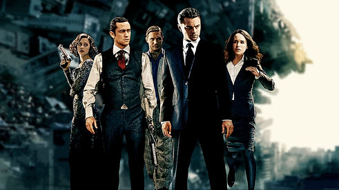
Furthermore, no violence nor gore was shown in my film trailer for Distortion thus challenging the conventions of a thriller, like in Split. This gave my trailer more depth to it and make the audience want to watch the film. This is due to the contradiction catching the audience by surprise as the film trailer focuses more on the psychological aspect of the genre rather than the action and the violence. Therefore, our opening sequence becomes a cliffhanger.
Often, in the genre of psychological thrillers, the lighting is always low key. This creates suspense for the audience as the darkness means they cannot see it in full detail, and when people are restricted with what they can know, they want to watch on to find out more. An example of a film trailer which uses a lot of low key lighting is The Black Swan. I challenged this concept by using high key lighting more than low key. I used high key lighting for the flash backs o show a previous time period and to emphasise it being a memory due to the crash changing his life.
In addition, in the film trailer About Time it uses the post-modern idea of being able to travel back in time. I wanted to reflect a more dramatic theory within my film trailer by making it clear that Tom could not change the past and he must live with the consequences. This emphasises a moral within the storyline and makes the audience reflect on their lives, as like Tom they might spend too much time on their phone and not appreciate what they have in front of them.
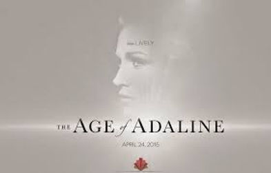
Lastly, I contradicted the font for the titles compared to the font of Age of Adeline's film trailer. This is because I wanted a more eerie and dramatic font to build more suspense to the audience. Age of Adaline’s font is very neat, like it has been typed on the computer. However, I used a distorted font to signify the warp in Tom’s realities. It also draws the audiences attention to the title so they remember it for when the film comes out.